Visit the Richmond, VA website


This page was last updated in 2021.
This client wanted a website re-design that was more inclusive of the
diverse backgrounds the city has to offer.
Since this client was a current client, the re-design process involved gathering the
clients google analytics information to review the current Information
Architecture to make sure that it was still relevant. We also used the client's current
SEO data to
gather information regarding their key target audience, the client's newest KPIs, and
the client's new design preferences.
Any new information helped to establish a strategy that informed the development of their personas,
the wireframes, and the website's re-design.
Visit the Richmond, VA website
The client had a number of key performance indicators they wanted to target with their new website re-design. I took these KPI's along with the data collected from their google analytics and SEO findings to develop a wireframe structure suited for their destination.

Practice Makes Perfect - I always design prototypes with the client's end goal always in mind.
Due to how the CMS works, client's have full capability of moving modules around,
swapping out content to their liking after launch, and being able to control which modules to showcase
on the website and which to hide. As the UX Designer and Web Designer, it's important to better accommodate for
the client's future goals and future content when developing the prototypes.
As the UX Designer, I developed the prototypes using color-theory for CTA's, designed with
proper accessibility standards, and with Gestalt Principles always in mind.

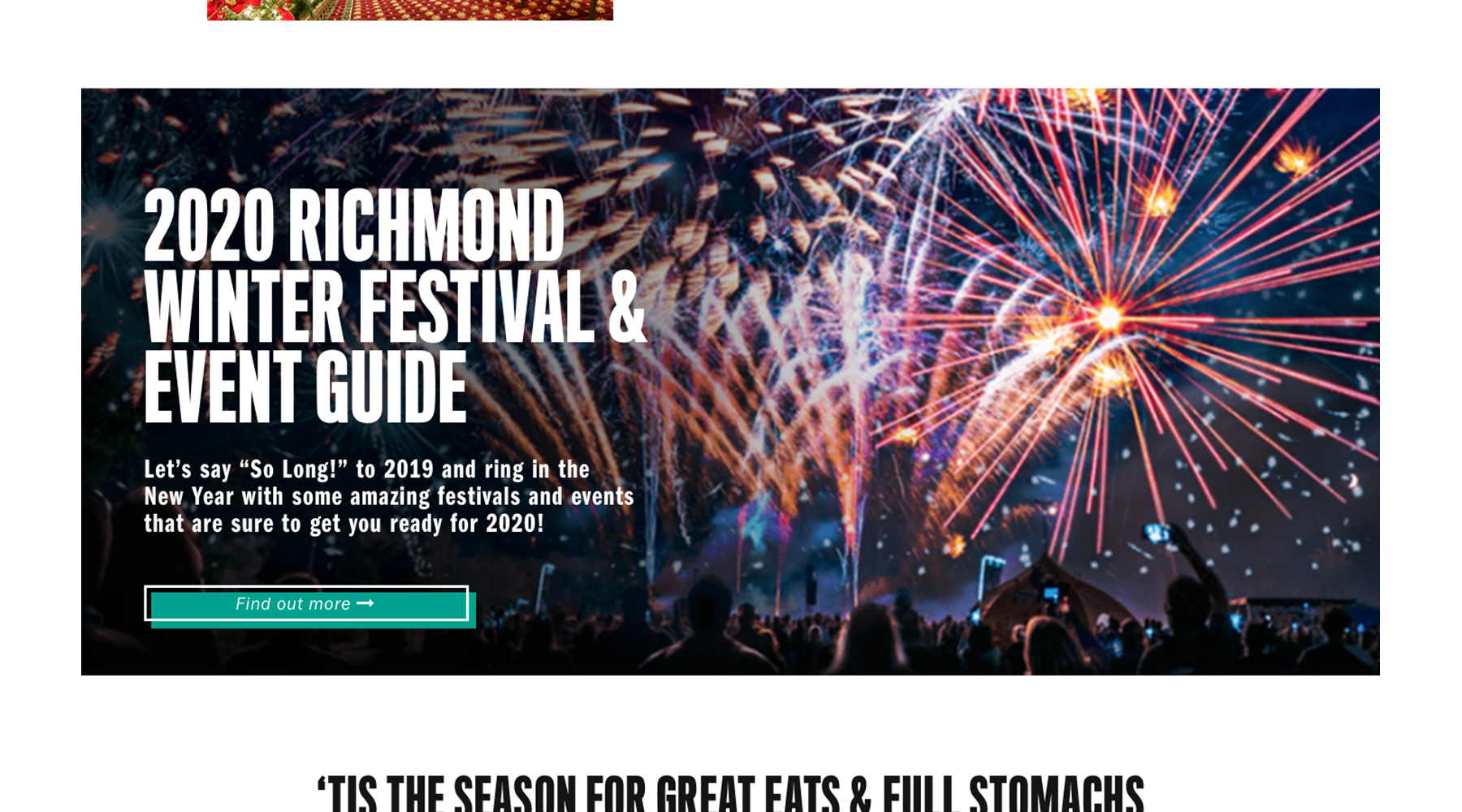

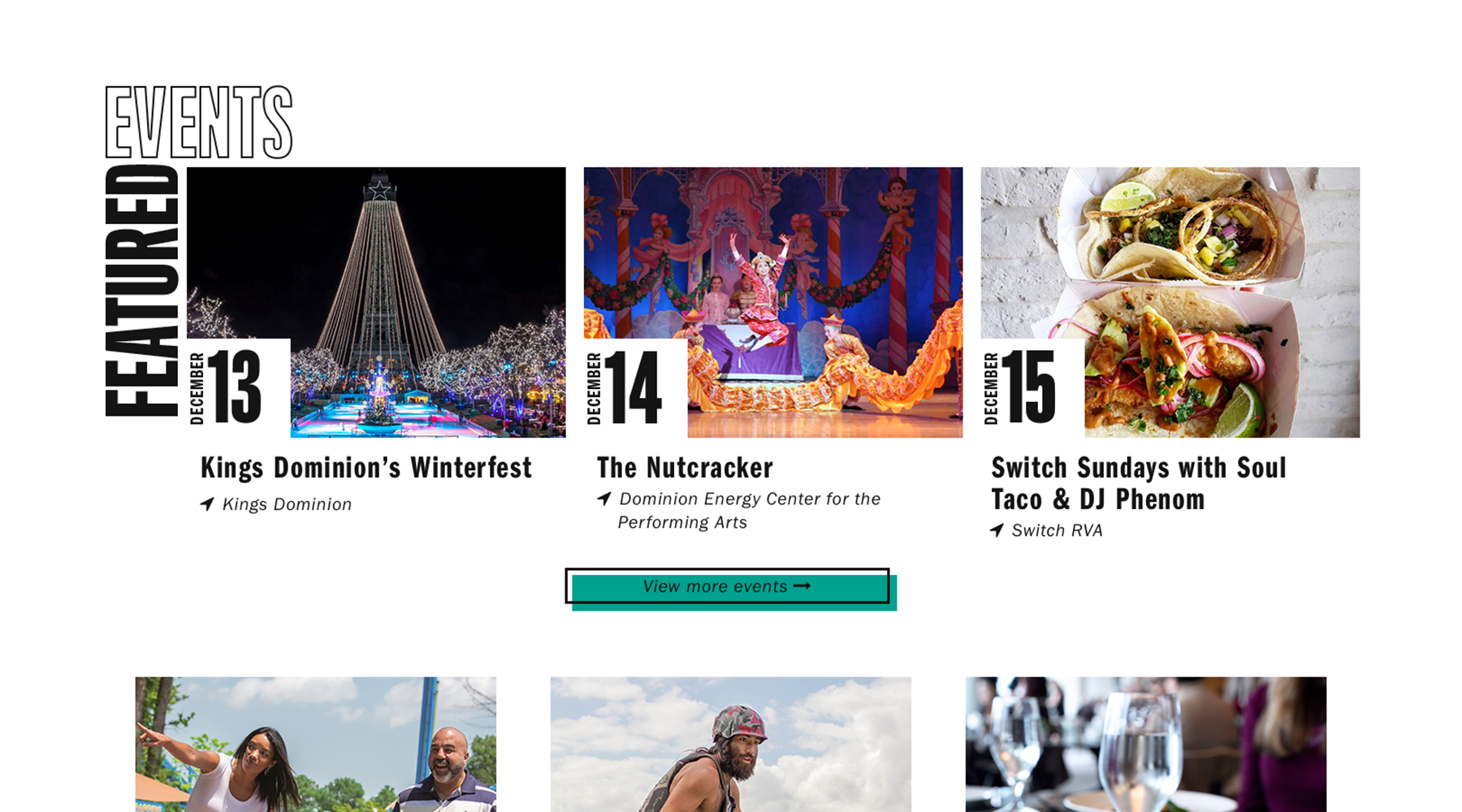
The client wanted to showcase featured events on the homepage and make it easier for users browsing the homepage to see the newest "top" events.